
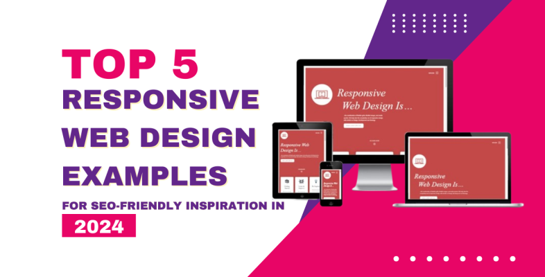
Keeping up with current web design trends is crucial to ensure that your website not only looks good but also operates effectively across all devices. Responsive web design (RWD) is still a critical component in developing user-friendly and SEO-optimized websites. In this blog post, we’ll look at seven great examples of responsive site design that not only captivate customers but also adhere to the most recent SEO best practices in 2024.
The Evolution and Growth of Responsive Web Design
Here’s a concise overview of the top three key aspects of the evolution and growth of responsive web design:
Mobile-First Approach:
The adoption of a mobile-first strategy is an important advancement in responsive web design. Because of the increased use of mobile devices, designers and developers have moved their attention to designing websites that prioritise the mobile experience. This method entails planning for smaller screens first, then gradually improving the layout for larger ones. It delivers a consistent and optimized user experience across all devices, contributing to the overall evolution of responsive design.
Technological Advancements:
The growth of responsive web design is closely tied to advancements in web technologies. The development of HTML5, CSS3, and JavaScript libraries has provided designers with powerful tools to create more flexible and dynamic layouts. Media queries, flexible grids, and responsive images have become standard elements in web development, enabling websites to adapt intelligently to different screen sizes and resolutions. These technological enhancements have played a crucial role in the evolution of responsive design.
SEO Impact and Google’s Mobile-Friendly Emphasis:

Responsive web design is also evolving in tandem with search engine optimization (SEO) strategies. Google, a dominant force in online search, introduced algorithms that prioritize mobile-friendly websites in search rankings. This emphasis on mobile-friendliness, known as Google’s Mobilegeddon update, has incentivized businesses and developers to adopt responsive design to maintain or improve their visibility in search results. The SEO impact has been a driving force behind the widespread adoption and growth of responsive web design practices.
Responsive Web Design Examples to Inspire in 2024
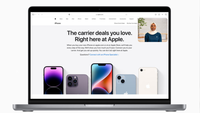
Apple (www.apple.com):
Apple’s website has long been a benchmark for innovative design, and in 2024, it continues to excel in responsiveness. The site seamlessly adapts to different screen sizes, providing users with an optimal viewing experience. The clean layout and well-organized content contribute to improve SEO, making it a prime example for inspiration.
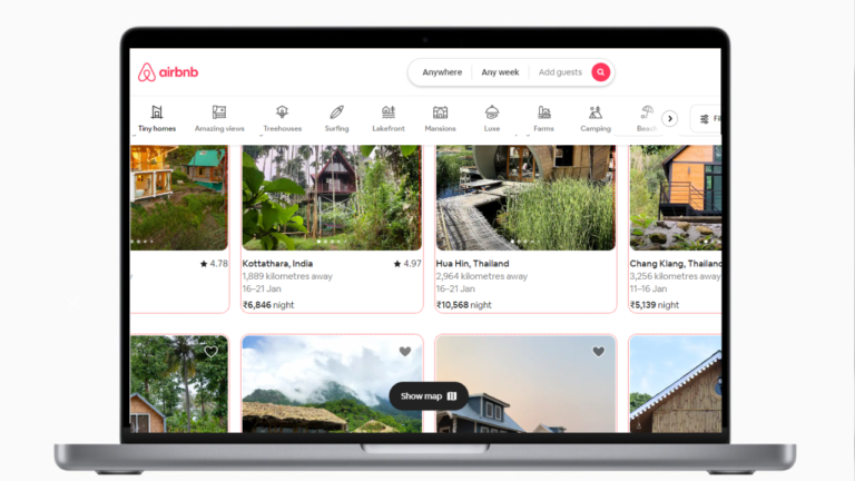
Airbnb (www.airbnb.com):
Airbnb’s website exemplifies the significance of a mobile-first strategy. The design is not only visually stunning, but it also adapts easily to different devices. This emphasis on mobile optimization improves user experience and helps search engine results.
Microsoft (www.microsoft.com):
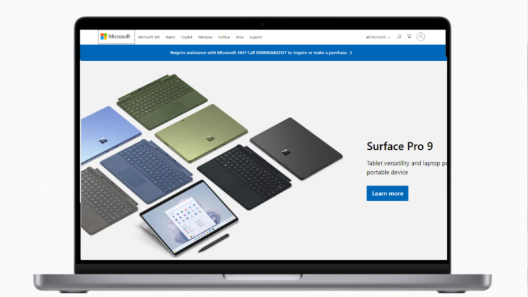
Microsoft’s website is a prime example of a large-scale platform that successfully implements responsive design. The use of flexible grids and images ensures that the content remains accessible and aesthetically pleasing across devices. The clear navigation and well-structured information contribute to search engine visibility.
HubSpot (www.hubspot.com):
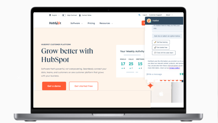
HubSpot, an industry leader in marketing and sales tools, has an excellent responsive design. Not only does the site adjust to multiple screen sizes, but it also prioritises content hierarchy for maximum user engagement. This dedication to user experience is consistent with SEO principles, which improves the site’s overall performance in search results.
National Geographic (www.nationalgeographic.com):
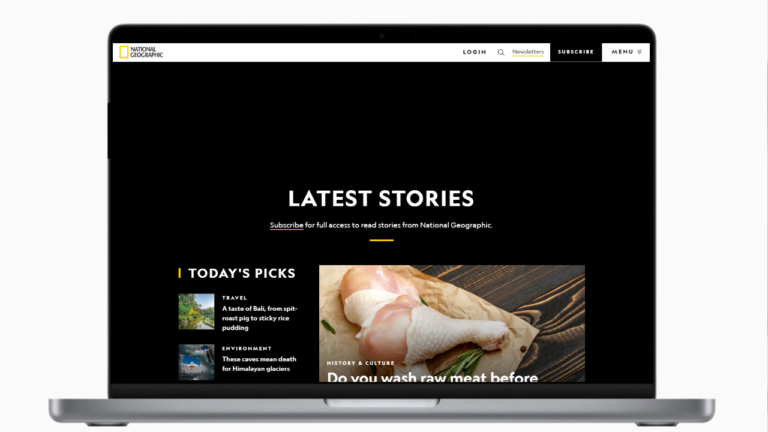
National Geographic’s website is a stunning example of how media and content-heavy sites can embrace responsive design. The seamless transition between desktop and mobile versions ensures that the captivating visuals and informative content are accessible to users across all devices. This adaptability positively influences search engine rankings.
Etsy (www.etsy.com):
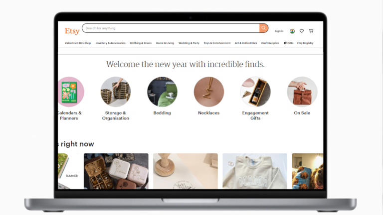
Etsy, an e-commerce platform, excels in creating a responsive and user-friendly design. The site’s layout adjusts smoothly to different screens, facilitating a seamless shopping experience. The intuitive navigation and quick load times contribute to a positive user experience, which, in turn, benefits SEO.
The New York Times (www.nytimes.com):
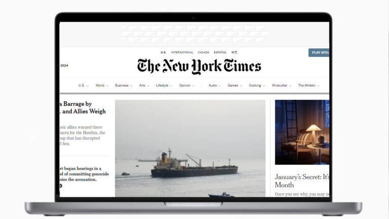
As a leading news website, The New York Times prioritizes responsive design to deliver news content effectively. The site’s adaptability ensures that readers can access news articles on various devices without sacrificing the quality of the reading experience. This approach aligns with SEO best practices, emphasizing the importance of user satisfaction.
How Monteage Creates Responsive Websites: Tips from the Experts
Tabular Data:

Tabular data is frequently used to organize and show structured information. Tables are frequently used to convey data such as price, product details, or statistical statistics. It is critical to guarantee clarity and responsiveness when introducing tabular data into web design. Responsive tables, which adjust to multiple screen sizes, allow users to access information across devices effortlessly and without affecting legibility.
Tab Navigation:

Tab navigation is a simple method for organizing material and improving user experience. Tabs are commonly used to categories content, allowing visitors to navigate between various areas of a webpage without having to navigate to a new page. Responsive tab designs provide a consistent and user-friendly experience on both desktop and mobile devices. Tab navigation is used in a variety of scenarios, including e-commerce product pages, dashboard interfaces, and content-heavy websites.
Calendar Displays:

Calendars play a crucial role in displaying date-specific information and events. A well-designed calendar, whether used for scheduling, event planning, or activity monitoring, increases user engagement. Calendar displays must be responsive to ensure that users can quickly navigate and view events on a variety of devices. Color-coded events and drag-and-drop capability, for example, add to a more engaging and visually appealing calendar experience.
Event Displays:

Event displays provide a visually compelling way to showcase upcoming events, conferences, or activities. These displays often include event details, dates, locations, and registration links. Employing responsive design principles ensures that event information is accessible and legible across different screen sizes. Interactive elements, such as hover effects and clickable links, enhance user engagement and encourage participation.
Conclusion:
Responsive site design will still be important in 2024 for both user experience and search engine optimization. You may improve your website’s design by pulling inspiration from these great examples, ensuring it not only captivates visitors but also ranks highly in search engine results. To keep your website ahead in the competitive online scene, keep an eye on developing design trends and SEO methods.

By clicking the “Subscribe” button, I agree and accept the privacy policy of Monteage IT Solutions Pvt. Ltd.
- All
- Blog
- adobe generative ai 1
- uncategorized
- what does nlu mean 8


By clicking the “Subscribe” button, I agree and accept the privacy policy of Monteage IT Solutions Pvt. Ltd.
- All
- Blog
- adobe generative ai 1
- uncategorized
- what does nlu mean 8
- custom software development
- mobile app development
- web application development
- quality assurance
- UI/UX design
- maintenance and support


Hey there, You have done a fantastic job. I will certainly digg it and personally suggest to my friends. I’m sure they’ll be benefited from this web site.
Thank you so much! I really appreciate your support and willingness to share the site with your friends. It’s great to hear that you think they’ll benefit from it. If you or your friends have any questions or need further information, feel free to reach out. Thanks again! 😊